
Start with the design and its colours
Black and grey uses shading and contrast to create form. It may suit your idea if you’re drawn to a portrait’s expression, an animal’s texture or the shape of a flower.
Colour gives you another way to define the design. Perhaps it’s the red petals, a character’s familiar palette or the colours of a place you remember that make the image feel personal. Explore PUREink.’s colour tattoo examples for ideas.
Try viewing your reference in greyscale. If something you love disappears, colour may be an important part of the idea.
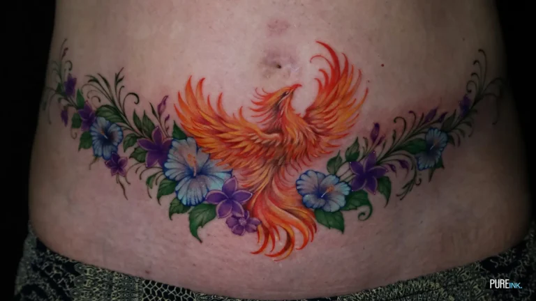
Compare black and grey and colour examples
Look at examples of the same subject in both approaches. Comparing a colourful full sleeve with a tiny black outline won’t tell you much about how your own design could look.
Use the PUREink. portfolio as a starting point, then bring a few examples to your artist. Explain what catches your eye in each one.
Discuss the palette on your skin
A reference on a bright phone screen cannot show exactly how a tattoo will look on you. Ask your artist to discuss contrast, colour choices and examples on skin tones similar to yours.
You can also ask about a mostly black and grey design with a small colour accent, if that fits the artwork.
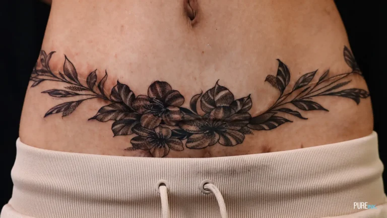
Make the decision around your design
Choose the approach that suits the image you want to wear. Bring references showing what you like about the shading or palette.
Planning your tattoo in Bangkok? Discuss your design with PUREink. and share your references, preferred size and placement. Tell us which details matter most before choosing your palette.